Introduction:
With the advent of the internet and Smartphones, the retail sector has changed drastically. From brick and motor shops to online, mobile apps and mobile web. People want this comfort, to browse the internet on a device of their choice, or through their favorite shopping app, to buy anything they want. From tiniest product like buttons to bigger ones like cars.
The key strategy for any retailer will be to attract potential customer, engage them to go to the product using a shortest possible path, finally close that engagement with a sale, means conversion of a customer to a buyer.
Post sales engagement with customers will come later. The real challenge is to make a customer buy the chosen product. If we can split these into a series of steps:
- Attract customers to come to your website
- Engage them to go to the product they want in a shortest possible time
- Make the customer a buyer by making them complete the sale.
First two points require a different article and not to be focused on this one. But the last one, how to convert a customer to a buyer, as they said technically in the retail sector, conversion and measured as the conversion rate is the key subject for this article.
There is a secret that can help you to improve your e-commerce business’s conversion rate.
That secret is showing a clear image of your products, again varying by size according to the need.
Seeing is believing an adage, is very true for e-commerce.
Will you buy a shirt or a pant or a mobile or a shoe without seeing them first? Since this is an electronic business, customers can’t feel the product. Hence for them, a visionary experience is critical. It makes or breaks the deal.
Let’s see in detail, how to win using images in e-commerce.
It’s all in your product Images:
When anyone visits your website with a product in their mind, the first thing they will look for in your e-commerce store is an image of that product. We, humans, need a visual confirmation. Our brain works that way. We need to confirm, what we see and what we have thought out as an option in our mind syncs correctly.
If you are looking for a brand shirt, you saw that brand in action, as one of your friends was wearing that at a party. You mentally make a note to purchase that shirt or at least that brand of shirt.
Then the next day you make a visit to the e-commerce website looking for that branded shirt. In this case, will you look for details, price or what discounts are available, when shipped? etc., etc.,
No.
What you will be looking for, is an image or images of that branded shirt. Once you see an image, immediately your brain tries to match the idea it has within with the visionary input it is getting now.
If those match then, and then only, you will go to the next level of details.
If not, you will try few searches and still not satisfied, then will move on to other e-commerce sites.
As an e-commerce business owner, you need to hit the bull’s eye within the few seconds of a customer landing on your website. Should I tell you that images are the only way?
It does not mean a blurry or not in proper shape; color images will do. Those images will be counterproductive for your website.
Instead, you need to provide excellent looking images. A decision on what to show, how to show it, various sizes, color combination and any other creative ideas, should be discussed upfront before you start a business and should be an ongoing activity as none of the websites nowadays has a static design.
They change, so should your images.
We went into detail on why images are important in e-commerce customer conversion rate.
Now we shall see few points you need to consider when you sit to decide on product images for your e-commerce business.
Things to take care
- Image quality should be the best always. Never compromise on this.
- Websites in today’s situation should change often. Re-designing is not a onetime activity anymore. You will need a continuous stream of high-quality images. Prepare for this upfront.
- Everyone loves a story. Selling a product is also like building a story for your customer to buy that product. Context is critical here. Your images should gel with your story and should make a customer immediately accept it. Remember our brain does not take an awful lot of time to decide. Usually, it is within 5 seconds. Only a correct, beautiful image in the right context will make them a buyer.
- Image background should never distract your customer. Your product images should have backgrounds that gel with the overall website color scheme. If you have a background for a product image, very powerful, that will influence your customer, and his brain will now switch its focus from the product to its background. In this case, immediately the mental mapping to his idea and the visionary input gets disconnected. Now he will move on because internally the sync has not happened. So be very careful when you create your images to decide on a perfect background for them.
- Finally, size matters. Why? It’s important for your product images should look good in the right context. What is the point to show a blurry picture, or a small image where a big one is needed and a big one when a small will do? Every image should fit perfectly in the overall page design scheme and should never show as an element that is out of place on a page.
Read Also: – How Image Retouching benefits an E-Commerce Portal?
It’s time for us to see a couple of case studies where businesses are doing extremely well using images.
I always choose Amazon as my first choice of website, purely, because of their image showcase.
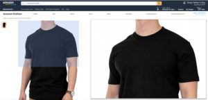
- They have the zoom feature. I can pick a product to say round neck t-shirt, then I can select a picture, zoom and move around to see the details and decide. It’s is a powerful feature.
- Apart from zoom feature, they provide excellent image quality, multiple images as required for every product. If I am going to buy a book, I can see the front cover and back cover.
- If I am going to buy a mobile, I can see all sides of that model.
Apart from this, we humans tend to read from left top to right bottom. I can simplify this as we look from left to right. So, placing an image on the left side makes you see them first. One of the most important strategies in Amazon success.
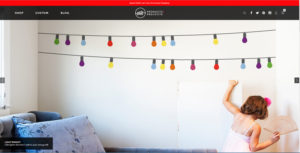
Whatisblik.com is a graphic wall product selling e-commerce website. If you see their website, the full-sized images that scroll in their homepage immediately attract the customer that comes in. If what a customer is thinking and an image shown on their home page maps, then it’s a win.
Then when you scroll down, you can see various products listed with a picture displayed prominently to the customer as visual information.
Attractive images like these, will hook the customer and convert him to a buyer very fast.
You see they are in business right from 2002 and going strong in 2017. It should prove that whatisblik.com is doing well and not a surprise after seeing the way they have showcased their products using images.
With the help of Product Photo retouching service provider, you can get a high-quality product image to engage customers. That’s what we business owners want right? To have high customer conversion rate, less abandoned shopping cart resulting in our digital cash register make that beautiful sound 24×7.


